Design Principles | Task 1: Exploration
- Date: 09/02/2026 - 23/02/2026 (Week 2 - Week 4)
- Deadline: 23/02/2026 (Week 4)
- Aishath Eshal Shihab, 0381863
- Bachelor of Design (Honours) in Creative Media - Taylor's University
- Task 1: Exploration
Task 1 Recap
In this task we are required to describe each of the design principles (Gestalt theory, Contrast, Emphasis, Balance, Repetition, Movement, Harmony & Unity, Symbol, Word and Image) and provide visual examples for further clarification. And then, we are to explore and select a suitable work of design that pique's our interest, write a short justification of about 150-200 words for selecting the design, and describe the principles of design that are found in that design.
Design Principles
-
Gestalt theory:
https://share.google/ID6Z7SRq0msDC4Mcl

Gestalt theory emphasizes that the whole of anything is greater than its parts. That is, the attributes of the whole are not deducible from analysis of the parts in isolation. (Brittanica, 2026) -
Contrast:
https://share.google/Rq7IGT3m6flE2ey1Z

Contrast is all about using opposites to capture your audience’s attention and draw the eye to key parts of your message. (Gaskin, 2025b) -
Emphasis:
https://share.google/OGSHGAVssGcJNxulX

Emphasis is what designers use to draw the eye of the reader to specific elements.This principle can be used not only to call attention to important material, but to ensure the visuals follow other design principles, like hierarchy, balance and proportion. (Gaskin, 2025c) -
Balance:
https://share.google/bKDEYZ650MfJbW5fM

Balance refers to the distribution and visual weight of elements in a composition. A well-balanced design is naturally pleasing to the eye and exudes a sense of equilibrium. (Gaskin, 2025a) -
Repetition:
https://share.google/hZd544BTXbUCQ7uqj

Repetition is the consistent reuse of visual elements like colours, shapes, fonts, or patterns to create unity, reinforce recognition, and improve the overall coherence of a composition. (Chu & Mika, 2025) -
Movement:

https://share.google/XgDdKYSPHubF0EtNf
it is the principle of design used to give artists the ability to lead a viewer’s eyes around an art piece. (Chang, 2021)
-
Harmony & Unity:
https://share.google/jXk2HV5KmjNaMX6Ps

harmony in art involves combining similar design elements for a pleasing, satisfying effect. Unity in art occurs when every element in the design supports a single idea or message. (Miller, 2016) -
Symbol:
https://share.google/0iPjnzifgCTUXip7L

a symbol can be any object, character, color, or even shape that recognizably represents an abstract concept. (Seymour, 2023) -
Word and Image:
https://share.google/6yb1H1645xWoCL7QJ

by merging words (type) and images (pictures), we can create articulate messages to engage a viewer or convey information. This can be done by skillful manipulation, interpretation, and juxtaposition of words and images, literally or figuratively, to imply a desired meaning. (Kennedy, 2017)


Design Work
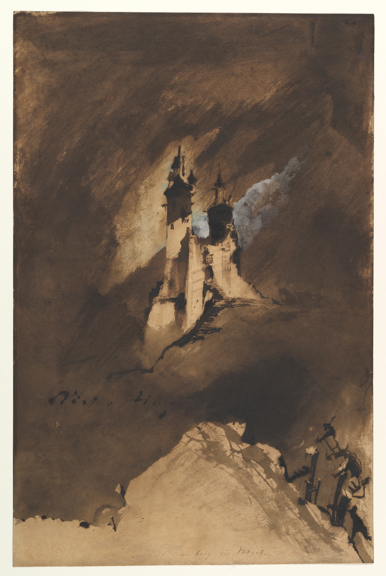
https://www.metmuseum.org/art/collection/search/400924
I chose this design for my task for three reasons; the contrast, the texture, and the overall feeling portrayed in the design. Firstly, the majority of the painting uses a monotone, beige brown colour and the artist has used a pale, baby blue shade in the centre of the canvas, behind the castle to create contrast and draw the viewers eyes in that direction before anything else in the painting. The blue being used in this way makes it look like there are dark clouds splitting and letting the clear blue skies show only where the castle is, to relay the importance of it. I am also very drawn to the visible brush strokes in the background, it is different from the castle because the brush strokes look messy and unintentional, whereas the castle has intentional pen lines and carefully done shading. This sort of texture also adds to the feeling that inside the castle things are more peaceful, organised, and calm, while outside of it, there is an ashy storm of uneasiness and confusion.
Design Principles Observed
- Contrast
- Emphasis
- Movement
- Harmony
Feedback
References
Chang, J. (2021). MOVEMENT: The principle of design. Online school
of illustration.
https://www.wingedcanvas.com/single-post/movement-the-principle-of-design
Chu, M. & Mika, A. (2025). The repetition design principle. Ramotion.
https://www.ramotion.com/blog/repetition-principle-in-design/
Gaskin, J. (2025a). A brief guide to balance – a design principle. Venngage.
https://venngage.com/blog/design-principle-balance/
Gaskin, J. (2025b). A brief guide to contrast – a design principle. Venngage.
https://venngage.com/blog/design-principle-contrast/
Gaskin, J. (2025c). A brief guide to emphasis – a design principle. Venngage.
https://venngage.com/blog/design-principle-emphasis/
Gestalt psychology. (2026). Brittanica.
https://www.britannica.com/science/Gestalt-psychology
Kennedy, J. (2017). Word & image. Graphic design
what it actually is....
https://ranchographics.wixsite.com/graphicdesign/word-and-image
Miller, D. (2016). Principles of design. Medium.
https://medium.com/@mdmillers/principles-of-design-fe57d900f85
Seymour, V. (2023). What is a symbol?. JSTOR Daily.
https://daily.jstor.org/what-is-a-symbol/
Comments
Post a Comment